
The basic idea behind adjusting the grayscale is very straightforward: we interactively display a fairly black and bright test pattern, while adjusting the RGBLowend and RGBHighEnd controls until the x and y values ​​are as close as possible to D65. Then we want the grayscale from 10 to 100 IRE to have the same performance and close to D65.
It seems to be simple? Unfortunately, it is usually not so simple. Digital displays can be fairly flat from black to white, but CRT-type displays usually require a little trick to get a fairly flat grayscale. For flatness, we mean that when we look at the final result of the previously described RGB chart, there are not many dents or ridges on the graph. We will walk you through the entire adjustment steps and tell you some tips to help you make your grayscale flatter.
Here is a memo reminding you of the actual effects of RGBLowend and RGBHighEnd controls:
RGBLowend: This control is used to adjust the amount of red, green and blue in the dark part of the gray scale from black to white. Imagine it as an individual brightness control for each color. When displaying a dark test pattern, we adjust these controls.
RGBHighEnd: This control is used to adjust the amount of red, green and blue in the bright part of the black to white grayscale. Imagine it as an individual contrast control of each color. We adjust these controls when a bright test pattern is displayed.
Step 6.1: Start with a green triangle and draw consecutive readings:
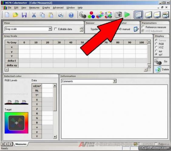
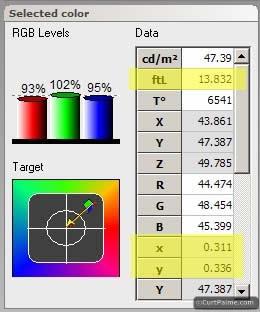
The sensor now retrieves the readings of x, y, and Y and updates the reading every few seconds. You should see the information in the "Selected color" window in the lower left corner fixedly updated:
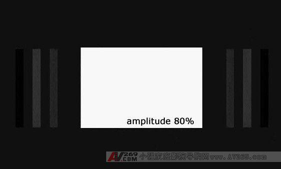
Step 6.2: In your Digital Video Essentials: HD Basics test disc, select the disc's menu option "Complete Program Menu" -> "Advanced Video Test Patterns" -> 1080p or 720p -> "Window 80% w/ PLUGE", Jump to the bright 80 IRE window test pattern. 80 IRE means that the test pattern is 80% white and 'window' means that the test pattern only accounts for a small portion of the entire picture (usually 10-18%). It looks like this:
Step 6.3: Adjust the red and blue RGBHighEnd controls on your display until all three RGB magnitude bars are at 100% or very close. Because each monitor works differently, you have to adjust at first to see how to adjust these controls to increase or decrease the amount of red and blue. A quantity of all three magnitudes is close to 100% and should be very close to D65 (x=0.313 and y=0.329).
Please note that we only adjust red and blue. Green is usually a reference and should not be moved to it. Because adjusting the green RGBHighEnd control (and balancing red and blue) has the same effect as adjusting the overall contrast control separately.
Ok! So now the 80 IRE point is set correctly on the D65! Don't be too happy, you will be adjusting it later!
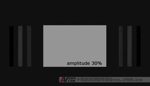
Step 6.4: On your Digital Video Essentials: HD Basics test disc, jump to the darker 30 IRE window test pattern. It looks like this:
Step 6.5: Adjust the red and blue RGBLowEnd controls on your display until all three RGB magnitude bars are at 100% or very close. Again, because each monitor works differently, you have to adjust at first to see how to adjust these controls to increase or decrease the amount of red and blue. A quantity of all three magnitudes is close to 100% and should be very close to D65 (x=0.313 and y=0.329).
Again, please note that we only adjust red and blue. Green is usually a reference and should not be moved to it. Because adjusting the green RGBLowEnd control (and balancing red and blue) has the same effect as adjusting the overall brightness control separately.
Ok! So now the 30 IRE point is set correctly on D65!
Step 6.6: However, there is an interaction here: adjusting the RGBLowEnd control will affect the RGBHighEnd control at the same time, and vice versa. Go back to step 6.2 and check the 80 IRE reading. Is it not in D65? Continue to do 6.2 to 6.5 until the 30 and 80 IRE readings are fairly close to D65 (x=0.313 and y=0.329).
Some tips will help you achieve this goal:
Adjusting RGBLowend doesn't do much for readings above 50 IRE, so it doesn't affect 80 IRE a lot. So adjusting RGBLowend usually does not require adjusting RGBHighEnd to compensate. Adjusting RGBHighEnd has a big impact on the overall grayscale. Adjusting RGBHighEnd will require adjusting RGBLowend to compensate. That's why we adjust RGBHighEnd first. Red and blue intensities affect each other: Lowering one will increase the other and vice versa. In fact, you may have noticed that everything affects other things! If you look at the readings of x and y, you will notice that the red control affects x, while the blue control affects y. To get the reading close to D65 (x=0.313, y=0.329) some practice is required. Only move some small adjustments at a time and wait for the read value to be updated twice before making the next adjustment. Because when you are making adjustments, the sensor may be in the process of reading the value, you need to wait for two readings to update the value. Step 6.7: Once you get the readings of both 30 and 80 IRE close to the magical D65 point, then we have to weigh the entire gray scale from 0 to 100 IRE. We know that 30 and 80 IRE are close to D65, but are other gray levels not like this?
Step 6.8 (Spyder2 users only): First adjust the read time to 2000 ms, select the menu option "Measurements -> Sensor -> Configure" and set the "Read Time" to 2000 ms, press "OK".
Step 6.9: Press the "Measure Grey Scale" button to start reading the entire grayscale. The HCFR will ask you to display the pattern from 0 to 100 IRE at 10 IRE intervals, one window test pattern at a time, and each graph stays in the sensor to capture the reading. In the Digital Video Essentials: HD Basics test disc, find the first test pattern. The 0 IRE test pattern can be found by selecting the disc's menu option "Complete Program Menu" -> "Advanced Video Test Patterns" -> 1080p or 720p -> "Video Black w/ PLUGE". The next test pattern is in the following sections.
Follow the steps indicated by the HCFR and wait for the HCFR to take the reading as before, while weighing the entire test pattern at a time.
Step 6.10: Select "RGB levels Graph" in the "Graphs" menu to see the results from 0 to 100 IRE. What does it look like? If all DeltaE values ​​are within 3, then luck is good (but unlikely)! DeltaE at each point represents 3 or less and absolutely no extra things you need to do or do . Your grayscale is so close to perfect that no naked eye can tell the slight error. If all of your DeltaEs are really within 3, you should buy a lottery right away, because this is rarely happening for the first time, and the chances are very low.
If your DeltaE values ​​fall within 10, then you are actually doing very well. Your grayscale is quite correct for most applications. If most of the points are between 3-10, then you can see if you can fine-tune some things, get a more correct reading of the entire range, or perform better between the more important 40-70 IRE ranges.
You should note that we currently use only two sets of controls to adjust the grayscale: one set of controls that affect the dark part and another set of controls that affect the highlights. Part of the adjustment to grayscale techniques is that if we can't make every reading from 10 to 100 IRE fall exactly on D65, it's a good idea to understand exactly where to compromise. The most important part is to make the 50-70 IRE mid-tone part correct, then the dark part below 50 IRE is correct, and finally the bright part above 70 IRE. If you have to sacrifice a part, sacrifice the 70-100 IRE range because most of the image content is below this range.
For each display, dark parts (especially those below 20 IRE) are particularly problematic. In fact, compared to what we said before, use your eyes to read 10 and 20 IRE or less, you will do better than the sensor, because most of the sensors (including the most expensive) in the dark Good results were not obtained when measuring the light output. If your grayscale looks good below 10 and 20 IRE, and the 30 IRE measurement is close to D65, it is good enough!
Some controls have other controls that allow you to flatten the protrusions or dents in your grayscale curve and look into your monitor's advanced menu or project. For example, the Barco Cine 8 Onyx CRT projector has some extra controls that we can use to get a flat grayscale:
Blue gamma slope: Reinforces the amount of blue in the bright part. Imagine it is a RGBHighEnd blue separate doubler that is used to reinforce the blue output in bright areas, because when you use a CRT projector, the output in bright blue is usually reduced. Blue breakpoint: Controls the point at which the aforementioned Blue gamma slope control begins to function on the entire gray level. A smaller value means blue means the entire IRE range will work, and a larger number means only reinforcing blue in the higher IRE range. These two controls are very powerful when adjusting the blue output. Red midlights: Increases/decreases the amount of red output in the mid-range IRE range. Blue midlights: Increases/decreases the blue output in the mid-range IRE range. If your projector has extra grayscale controls, try out their features and really understand their true functionality, and flatten your grayscale if needed. Because these additional features are specific to each display, we won't discuss more details in this regard.
Keep in mind that one important thing, when you're adjusting your grayscale, it's impossible to understand the grayscale that is absolutely perfect. You don't need to reach very flat grayscales to get amazing images. Don't worry that you can't reach perfection. Just get your grayscale close enough to get a lot better images than before.
The last thing you need to know is that some new high-end video processors, like Radiance , have features called parametric grayscale correction. It allows you to fine-tune any point from white to black (instead of only 2 points of adjustment), which can increase or decrease the intensity of the signal arbitrarily, which is really very powerful. One such processor is the only way to get a completely flat grayscale.
Step 6.11 (CRT projector and CRT rear projection TV only): Getting a near flat grayscale on a CRT projector is more tricky because the characteristics of the CRT tube are not as linear as a digital display. In contrast, this means that once you adjust your CRT projector, the difference will become apparent! A very common problem with CRT projectors is the phenomenon called 'blue bumps'.
In CRT projectors, the blue output typically drops at higher values. As you did before, when correcting 30 and 80 IRE points, the results on the CRT usually look like the following:
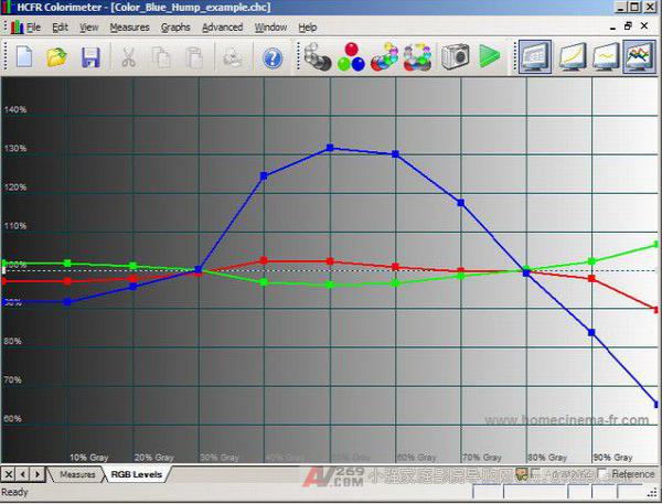
This is called 'blue bulge' because there is too much blue in the mid-range of 30 to 80 IRE, while other areas are not enough. If we adjust and adjust RGBHighEnd and RGBLowend to make the point around 50 IRE normal, the blue output will drop at both ends of the chart, so we will not be better than before the adjustment.
Fortunately the solution is simple: the electronics are defocused blue. The blue light output will increase via the electronic defocus blue tube, allowing us to lower the RGBLowend and RGBHighEnd values ​​and thus achieve a more gradual grayscale. This defocused action must be electronic, not through the lens that adjusts the blue tube. Electronic adjustments can be made with a remote control (in newer electromagnetic CRT projectors) or a G2 adjustment button (older electrostatic CRT projectors). Check the instructions in your user manual.
All projectors have some degree of blue bulge, and at the same time a defocused blue image tube is necessary to some extent. Some CRT projectors even have the option of automatic defocusing: after you have installed the projector and adjusted the sharpest blue as much as possible, you can defocus the blue to a preset value by switching a switch.
In order to lower the blue bulge, after defocusing a little blue image tube, do it again from step 6.2. When you re-measure your entire grayscale, the blue bumps should decrease. Do more defocusing and do it again at the same time until it does not lower. Don't worry if you need a lot of blue defocus. Defocus may be visible in front of the curtain, but even a very large amount of defocused blue is not seen by the viewer sitting at a general viewing distance (1.2-1.5 times the width of the curtain). Because our eyes are hard to focus on blue.
Step 6.12: A common problem with all displays is that when the light output exceeds 80 IRE and is close to 100 IRE, if your contrast control setting is too high, then a particular color is 'saturated' before other colors. The digital display is usually red first, so we use red as our example. When the contrast control is turned up, the red output usually goes to the top without increasing, but the green and blue outputs continue to increase. This causes a significant reduction in red output at 90/100 IRE, which looks like this:
Why is this? (Thanks to Forum member Scott_R_K): In the early days of the home theater, many digital projector manufacturers simply changed the projector's red color slightly as a home theater projector. These projectors are deliberately designed to output more blue and green to create a brighter picture and higher light output, as this is the main requirement in the briefing: sacrificing the correctness of color Higher light output. The red output efficiency of the bulbs that these projectors are equipped with is usually very poor (like the CC30R color correction filter will be helpful - talk later).
The only workaround is to reduce the contrast control if the red output is below 90/100 IRE. When the 100 IRE test pattern is displayed (refer to Part 4: Setting the white level), continuous measurement is performed while the contrast control is continuously lowered until the x value (red) is 0.313 or the decrease is stopped. This will be the highest contrast control you can use and maintain the correct red output relative to green and blue.
For your monitor type, if you have to lower the contrast control until you can't reach the ideal ftL light output range, you have to decide: sacrifice the correct color in the high IRE range to maintain a high light output, or sacrifice the contrast value. And the light output is exchanged for the correct color in the high IRE range? The answer is usually the same, the correction needs to be determined for your individual settings, to determine the trade-off between them to get the best picture. Welcome to China Home Theater Network
Try both and make a decision!
Of course, this type of problem can also occur in green or blue, but this is rarely the case on digital displays. Anyway, if you find that one of the color outputs is lower than 80 IRE, try lowering your contrast control to see if it solves the problem.
Step 6.13: Since adjusting the grayscale affects the previous settings, we need to go back and check our contrast control and brightness control (refer to Parts 4 and 5). Regarding the comparison control, we want to confirm that we are still within the ftL range expected by Part 4. You can do this by simply taking a look at your last full-range measurement of the west, 100 IRE ftL reading. Usually your contrast control settings do not require any adjustments.
As for the brightness control, you have to confirm that you have no details of the dark part (black crush caused by the brightness control setting too low), or the black color is grayed out (the brightness control setting is too high). You may only need to make one or two adjustments at most.
If the contrast control or brightness control changes, you should perform a further set of grayscale readings to confirm that the RGBLowend or RGBHighEnd controls do not need to be fine-tuned. Through each iterative process, the amount of adjustment will be smaller and smaller, until each project is finally stable until you can achieve the best results.
Congratulations! You have corrected your grayscale!
Part 7: So what does your grayscale look like now?
We did it again and redo our Barco Cine 8 CRT projector, so let's take a look at the results before and after. Let's turn on the gamma enhancement of our Crescendo-Systems RTC2200 to reinforce the signal (mostly in the dark). This helps us get better illumination gamma with better dark detail.
We also deliberately leave some 'problems' in some places in our results, so that you can see some close but not perfect results. In this way we can explain which corrections are needed and how to fix them (if possible). Showing your completely flat chart can't help anyone, because we all know that it's the result you want to achieve, and the hard part is the process of achieving this result. The 80% completeness is a simple part, and the remaining 20% ​​is usually impossible. The good news is that getting a lot better picture quality than before is not going to be 100% perfect to get.
ColorHCFR has a great feature that lets you compare data from two files. Set a set of data as "reference measurement", all other data will be compared with the reference measurement. To use this function, just load your pre-adjustment data and the adjusted data file, select the pre-adjustment data file in the "Window" menu, and press "Reference measure" as shown below:
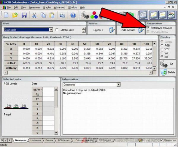 Now reselect the adjusted data file in the "Window" menu. All the data in the adjusted chart will be compared with the pre-adjustment data you selected. If you don't see the pre-adjustment data on the chart, right click anywhere on the chart and confirm that the "Display reference measure" option is selected.
 Original data:
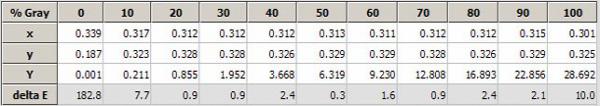
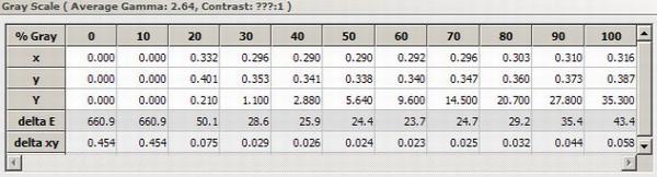
Below are our pre-adjusted and adjusted raw data readings. Remember that our sensors only provide x, y, and Y, and everything else is calculated by ColorHCFR. For all points on the entire grayscale from 10 to 100 IRE, we try to reach the target value x=0.313/y=0.329 D65, or at least DeltaE is below 10 (perfect is below 3) grayscale.
before fixing:
 adjusted:
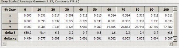
Except for our 10 IRE readings, most of our adjusted values ​​are now very close to D65 with x=0.313/y=0.329. Not bad at all! The 9/9 reading of DeltaE is less than 10, and there are 5 points even falling below 3 (in the important 40-70 IRE range), very good! Welcome to China Home Theater Network .com.cn
This time we also took a reading of 100 IRE, mostly because we started the gamma enhancement of the RTC2200 . Our maximum illuminance (Y) value was also increased to 47.4 (13.8 ftL) at 35.3 (10.3 ftL) to give a brighter and more impactful image. This is fully in line with the 12-16 ftL range required by the projector. What's interesting is that our projector's contrast control settings haven't changed at all!
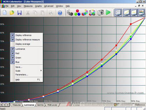
Figure 1 - Brightness (or light output):
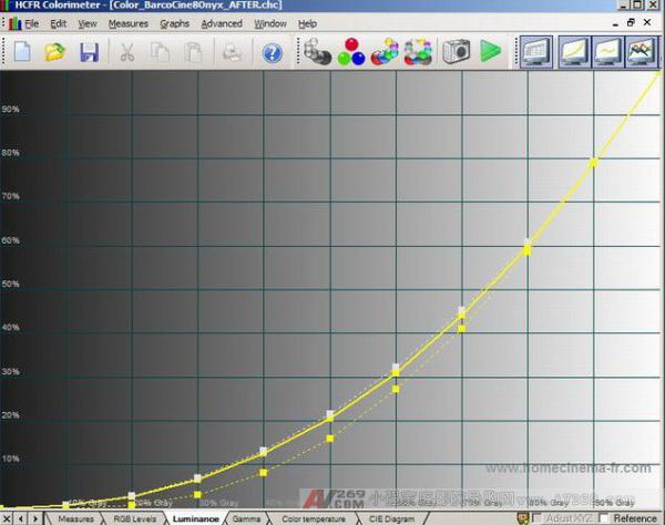
The "pre-adjustment" reading is a yellow dashed line, and the "adjusted" reading is a yellow solid line. As you can see, we are very close to the white dotted line that represents the target. If we fit this line perfectly, we will get a 2.2 gamma. Although our adjusted readings are better than before, we still have a little low range. (It's hard to see in our small picture, but in the software you can zoom in on the image and see it more clearly. In fact, throughout the entire range, our entire reading falls below the target). We may have to increase the gamma enhancement of the RTC2200 and re-measure it again.
If we turn off the "pre-adjustment" reading and display the red, green, and blue "adjusted" readings separately, we can see the following figure:
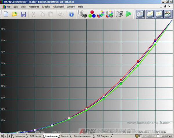
Red is above the target, green is below the target, and the blue is completely close to the target. In fact, we have no way to adjust anything, and they are not too much and they will change when we fine-tune gamma reinforcement. Displaying individual colors can provide some additional information. We try our best to adjust the grayscale to the best level, and we can use this chart to see what we are doing.
Figure 2 - Gamma:
Our gamma is now very good, our average (cyan line) dropped from 2.64 to very close to the target 2.2 of 2.27.
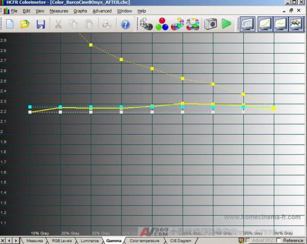
The yellow solid line is our "adjusted" gamma, and the yellow dotted line is "before adjustment". Our new gamma is now very close to the white line of the 2.2 gamma target value. Raising the gamma reinforcement mentioned earlier may make our average closer to the 2.2 target. (Upgrading gamma reinforcement will reduce the value of gamma). Welcome to China Home Theater Network
Remember that the average gamma we want is a target of 2.2. The default target value for the ColorHCFR software is 2.2. This value gives us a perfect balance: enough brightness and very good dark detail. If your room is only extremely reflective and quite black, and you use the same high contrast display (such as a CRT projector), 2.5 gamma looks ok, although 2.2 may look better.
In our case, we used the RTC2200 external box to increase the gamma reinforcement, which helped us get a more suitable gamma value. This box and many high-end multipliers (Lumagen, Crystalio), Moome HDMI cards and converters , and X-Vue Box1020 , Box1021 and Box1040 RGB/Component converters have built-in adjustable gamma reinforcement. If you only need gamma reinforcement at the cheapest price, consider the GammaX add-on. It was designed by the popular HDfury2 HDMI to RGB/Component converter .
If your average gamma is higher than 2.2, you need gamma reinforcement. Since most monitors do not have built-in gamma reinforcement, if these external boxes are the only way to achieve perfect gamma from black to white, consider adding one. You don't have these devices in your signal chain, many monitors won't be able to reach the right gamma, and you'll get an image that lacks dark details, dullness, or no sense of living. More on how gamma reinforcement works, before and after the screen shot, and why it is needed (especially CRT monitors) can be seen in this discussion: Gamma Correction: What is it? Why is it needed?
If we turn on individual colors and see the front and back comparisons, we can actually see how bad the values ​​are before (indicated by dashed lines):
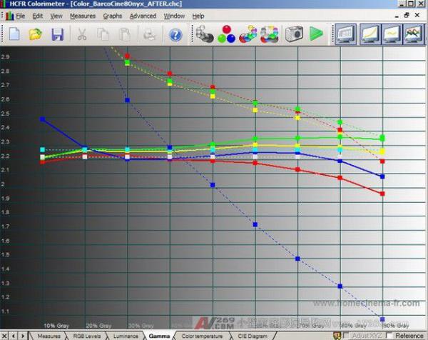
"Before adjustment" Blue gamma is particularly outrageous, which is very typical.
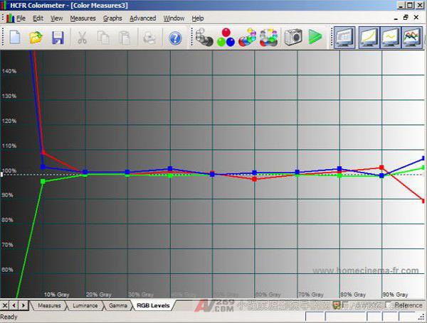
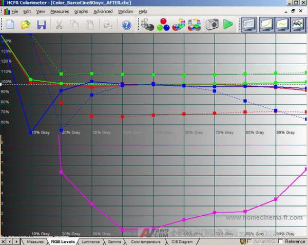
Figure 3 - RGB Levels:
Our RGB levels are quite close to the 100% target in the entire grayscale from black to white:
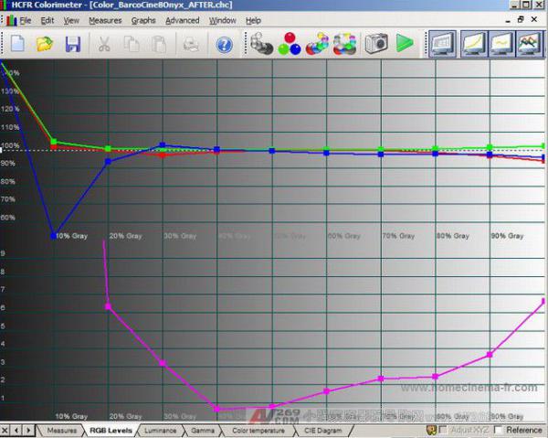
With the exception of 10 IRE, DeltaE at all points is ideal for less than 7. Sometimes you have to sacrifice the highlights or shadows to make the other parts flat enough. In our case, red and green are quite good in the dark, only blue is deviated and falls very low below 10 IRE. You can see that gamma starts to drop at 20 and 30 IRE. Welcome to China Home Theater Network
The obvious solution is to simply increase the blue RGBLowend value and get more blue in the range of 0 to 50 IRE. We have tried, but using this method to increase the blue of 10 IRE will also add a distinct blue bump between 20 and 50 IRE. Although our DeltaE 48 at 10 IRE looks quite large, the 10 IRE is very dark, and in actual movie content, it is less noticeable than the 20-50 IRE blue bump.
This is a good example of a more convenient high-order multiplier with built-in gain or cut functionality: we might use a blue color that only increases the 0 to 20 IRE range. At the same time, remember an important thing, it is very difficult to achieve perfection, 80% of the progress can get a lot better than before. At lower IRE's, the blue color may look bad on the data, but in fact the eyes are completely unnoticed or feel that there is a problem. If you feel the value is fixed, you can buy a Radiance to solve the problem (unless someone wants to donate one).
Let's look at a comparison before and after a 3 RGB line adjustment:
It's a bit ugly, but the dashed line is the measurement before “adjustment†and the solid line is the “adjusted†measurement. Throughout the range, red was raised to a good condition and green was reduced to a good condition. Blue is not falling at high IRE, and blue at low IRE is now only starting at 20 IRE, not at 30 IRE. Overall better than before!
Figure 4 - Color Temperature:
This is the color temperature chart before and after our adjustment:
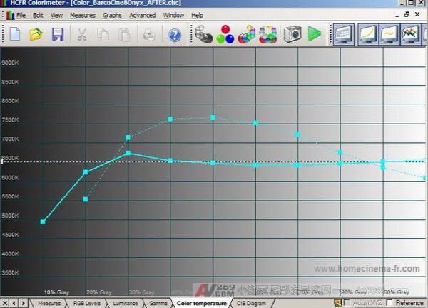
The dotted line is the “before adjustment†measurement and the solid line is the “adjusted†measurement. Our "adjusted" results are quite close to 6500K in the entire range, but as mentioned earlier, this chart is a bit useless because it does not consider all the causes. Ignore it and replace it with other charts.
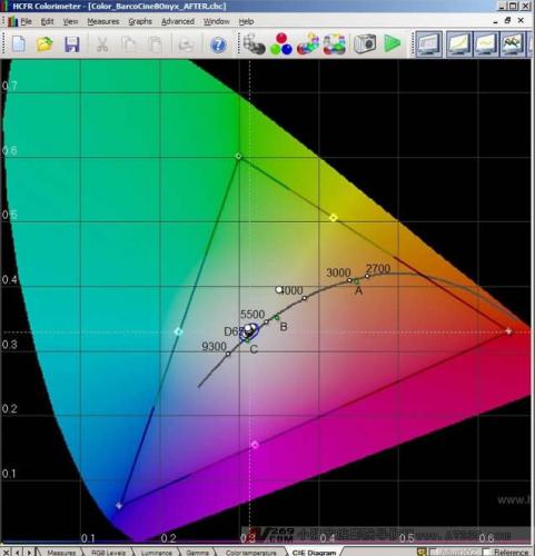
Figure 5 - CIE diagram:
Below is our CIE diagram showing the results of “adjusted†(for some reason, ColorHCFR cannot display “pre-adjustment†and “adjusted†grayscale readings on the same CIE chart at the same time).
Let's zoom in and see the results of “before adjustment†and “after adjustment†to the same chart to make the difference easier to see:
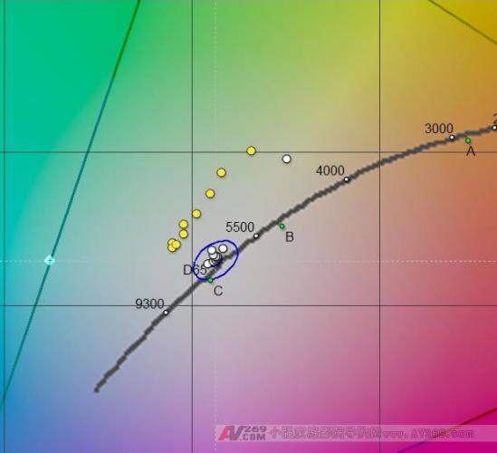
The “before adjustment†reading is a yellow circle that falls above the target D65 point, and the adjusted value is a white circle. As we already know, we are closer to target D65 than before. Only 10 IRE is off, all other points fall within the blue circle of DeltaE <10 and 50% even fall in the DeltaE <3 circle (hard to see).
This is the grayscale reading before and after the adjustment. Sit back and enjoy one or two movies to see how good the color, detail, and image look is. Now everything is very close to perfection.
filter,cylinder,solenoid valve
Wuxi Trenty Machinery & Equipment Co., Ltd. , https://www.elec-inverter.com